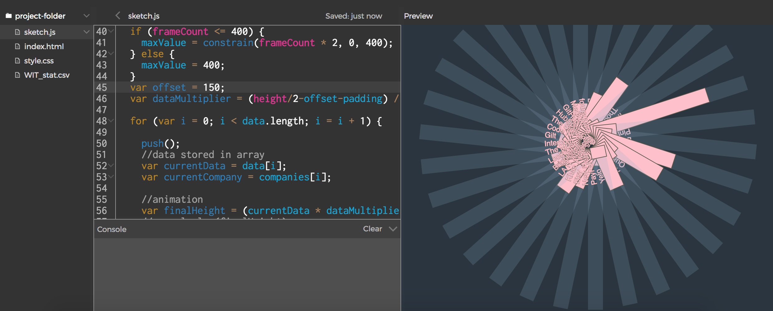
Just learning about data visualization, I found a starter code created in vanilla javascript courtesy of Engin Arslan.
From here on, I learned about using .csv file that contains data from Project Include. I was very much intrigued by the ratio of women and men software engineers working in startups and 380+ tech companies, as compiled by Project Include Founder, Tracy Chou here: https://github.com/triketora/women-in-software-eng. I sifted Top 40 recognizable ones, as the design works best for only a few.
Future plans for visualization. It is a very old list, so I one would like to make this site available so women can update the information!
- Some buttons that show different categories: High 40, Low 40. 40 is the best number to show a good readable amount
- A table version so companies can update this list. The CSV has 250 companies so far.
- Just enough to be dangerous, how about some JSON objects?! and API’s!
Here’s the final product: A Data Visualization of the Ratio of Male/Female Engineers in tech. Peek into my code: https://alpha.editor.p5js.org/kriziafern/sketches/B16MzAoTZ I hope to meet Tracy Chou and set a coffee date with her if I ever visit in LA. 🙂


