This week I decided to track my commute after brainstorming with Miki and Alice. I ended up doing the project independently because I was stumped midway on ideas for execution. I thought my day-to-day commute would be repetitive but was surprised to see how eventful my week was!


I knew for sure I wanted to explore this type of infographic to show progress and output really interesting illustrations.
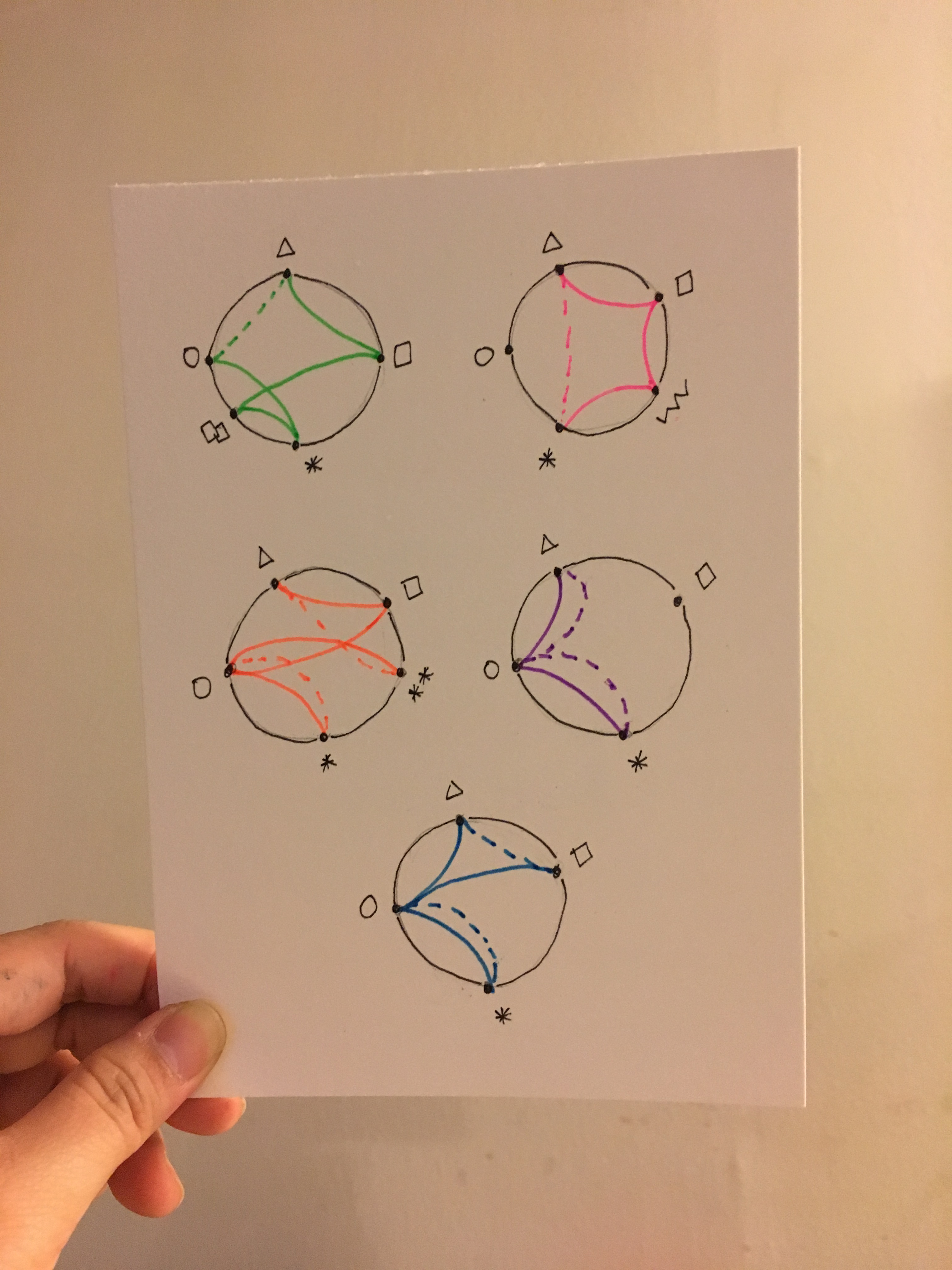
I didn’t plan ahead except that I knew my usual locations would be would be Work, School and Home. Everything else would be a wild card. The week ended, and I realize friday was the most uneventful day. The colors I used should represent the day of the week, and the line textures represented if I was coming or going to the location so that other readers would be able to map my footprints easily.
To make it more abstract I made the labels into shapes!

Here’s a video of me thinking while drawing. What isn’t shown is that I was looking at my old sketches and I was validating and recalling how that day went vividly in my head. Also had my sister record me she said I was taking too long (LOL).
I created a legend list in the back to explain the illustration.

Here is the final outcome!


Excellent. Great to see your process and documentation. Also it is interesting that you make it clear that sometimes data tracking is fuzzy; Dealing with that means “doing your best”. One thing that comes to mind is how beautiful, slick visuals can be beguiling since very seldom do data come without their flaws. I’m glad you got to make a chord diagram https://datavizcatalogue.com/methods/chord_diagram.html!
LikeLike